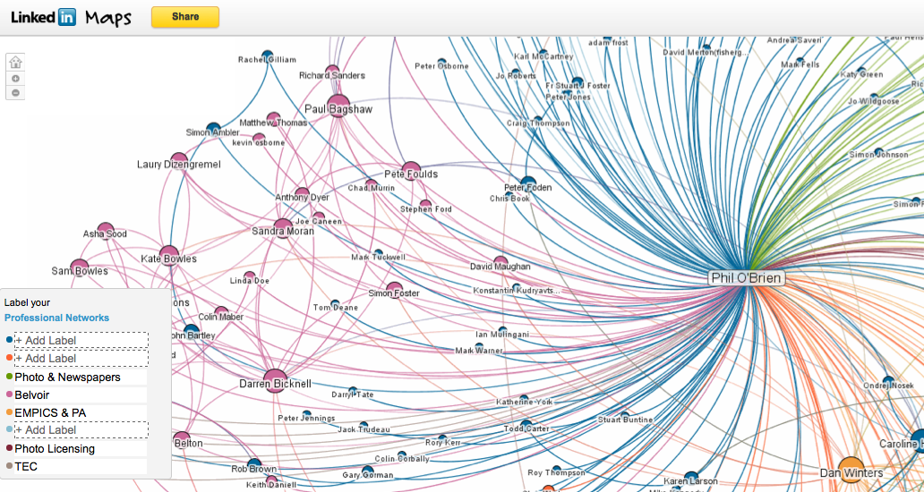
LinkedIn have just launched a new tool to create a visual map of your connections – InMaps. It’s a very interesting tool – and is an important step towards understanding your Personal Network.
I was surprised at how in certain areas of my network, the system was able to colour code by groups. In fact, some of it was a bit “spooky” and gave me a feeling that Big Brother was watching. You can see why these powerful network visualisation tools have been used by security forces to check terrorist connections (none in my network – I hope!). However, in places, it was not easy to work out what the common thread of the colours were – as you can see from the incomplete key on the screen grab above.
It’s a newly launched service – but already seems to have rich features. For example, you can click on any connection – and see who they are connected to in your network.
The system is polarised by just being an overview of LinkedIn connections. I recently did an audit of my contacts – and I’d only connected to 11% of them in LinkedIn (with 71% of them being Weak Ties). I am sure this might be different for others – but I am sure it is always an incomplete picture. See my earlier post – Are the people you REALLY want to know social networking?
Anyway, if you are a LinkedIn user, I would encourage you to have a play. Go to http://inmaps.linkedinlabs.com/. Check out the video below for an overview from DJ Patil, Chief Scientist at LinkedIn.
>You can now get more info in my second post about InMaps – including video of DJ Patil giving further explanation of his network and development of InMaps.
