If you’ve read this blog from the start – you will know that one of the challenges that I have set myself is finding a way to visualise your Personal Network. The name of the business that I intend to launch next year – VizWho – gives a clue to its aims (Visualising Who you know).
 The starting point for some of this thinking was the discovery of the Visual Thesaurus (produced by a company called ThinkMap) – our CTO, Dan, pointed it out to me. It’s a cool, interactive product that explores the “network” of relationships between words – and I thought it would be great if your Personal Network could be explored the same way.
We’ve just started our research stage – involving getting 6 case studies together based around diverse individuals. In the research we help to organise their Personal Network in a visual way. Initial findings are very positive – more soon….
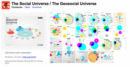
I did come across another great visualisation relevant to Personal Networks. This work has been undertaken by Jesse Thomas of the JESS3 Labs in Washington DC. JESS3 Labs is a creative agency that specialises in data visualization (sorry – you’ll have to get used to the change in “s” and “z” as we cross the Atlantic!). See below:-
This illustrates that out of the world population (and specifically the mobile phone using element) – the level of Twittering, Facebooking and LinkedIn-ing is relatively small. In my initial research on Personal Networks – I am finding similar patterns at the “me” level. A person does know some contacts through the likes of LinkedIn, Facebook and Twitter – but these are a very small percentage compared to their “real” Personal Network.
It’s a great bit of research – and the illustration above is just one example of how the data has been illustrated. Explore some more visualisations by Jesse at JESS3 Labs.

Would be interested if you can point me in the direction of other visual illustrations relevant to Personal Networks.


